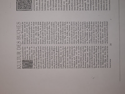
Repeat patterns, using traditional print flourshes.

Bevel borders and traditional serif typefaces.


Tight guttering, larger margins and larger leading that create a very traditional typography feel.

Both of us think that these bevel borders and titles look really nice, so they're going to be a direct influence on some of the spread design we create.


No comments:
Post a Comment