Text to come
Monday, January 31, 2011
Michael Friemuth
I stumbled upon Michael Freimuth when looking at the shellsuit zombie blog. I think his work is incredible, beautifully crafted contemporary typography. The first couple of spreads are from a magazine called materiel. The tight gridding and minimalism really just look amazing. It appears to be a 6 column grid, and the varying ways this has been manipulated create a variety of simple yet precisely executed and well crafted typographic layouts.
This one below for Goldfinger isn't quite as effective to me personally, but it's still very well executed layout. The colour choice ties to the theme nicely, and the pull quote is placed appropriately in the hierarchy so the eye goes from picture to pull quote to body copy.
I really just liked the simplicity of this, with a nice bit of debossing or embossing. This is something that can be doen through the letterpress and I'd really like to have a go at this in one of my projects.
I like the logo-form in the corner, and the clear identity this creates. It has a very classic feel to it, that seems to be very in right now.
The past two year books.
I thought it was worthwhile analysing the first two yearbooks, to try and get to grips with what about them I do like, and what I think could be improved. This will allow us to make a very informed decision as a group.
This is the first year's cover. I do like it's simplicity compared to the photograph on the front of the second year book (below), which doesn't say very much. The textured cover, bookrum/hessian/something similar creates a quite nice contrast between it's texture and the smoothness of the pages, which means that the cover feels like it contains the contents very well. I think with the theme of legacy, we're better off approaching the simple option rather than the photographic option. The second year's cover just doesn't say anything of our course, it's blank, rough and scrappy paper. To me personally, it doesn't feel like it sends out a very good message.
In terms of quotes from Fred, I think the second year's layout is stronger. The large 'B' against such a thin weighted type feels like it doesn't have enough presence. Where as the second one uses helvetica which has a lovely balanced weighting on the page. Personally, I don't like the banana yellow that is used in the first year book either.
Both contents pages are pretty nicely laid out, I'm not a big fan of having the horizontal blocks of text if there's a lot to read though, it makes the whole book less readable as you flip the pages round to try and read it. For that reason, I'd want to favour the much simpler layout of the first contents page.
Out of these pages, concerned with quotes from Lorenzo and Amber, I'm keen on the dynamic the change in font size creates for the pull quotes in the first year book. I also prefer black on white to the white reversed out on red in the second year book. However, I think in this case, there's little enough text on the column that runs vertical for it to be readable, and that's more interesting to me than the way the names are laid out on the first year book.
I'm not sure which of the two I prefer with the studio photos, but I think that both seem to work quite successfully. I think the clarity of the first photograph might make it feel a little more crisp to me.
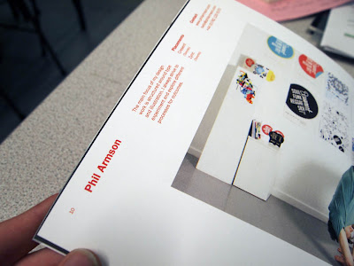
In terms of laying out the work and the photographs of the students, the second one is applicable to what we're doing, their identities are often obscured and they're interacting directly with their work, or at least on most of them. This makes sense to the idea of legacy in a way, the work is what is significant, the person themselves isn't so much. I do like the sense of fun the photos of the people in the first one bring, but I do think that the second year book's layout allows them to showcase their work a lot more. Also, I still have problems with the text running vertically, but it does create quite a nice dynamic between people's work and the text, clearly differentiating the two.
Initial ideas about Garry Barker's publication.
OK, so firstly I emailed Garry Barker today, I wanted to know if he had an ovearching title for the whole publication. He replied:
No, I was thinking of changing headings/titles as to need. My name would be the only constant.
Cheers
Garry
This makes it difficult for me in terms of designing something that binds the work together, other than using his name. I am tempted to ask him if he has got seperate titles for the individual publications. This will just give me a bit of content that would really help me jump into it, rather than 'Lorem Ipsum-ing' everything.
Above are just a quick few concept sketches of the possible ways that this publication could work, but I'm thinking that it will be more effective to start making paper mock ups to really get some creativity going. With year book looming, this si something I might have to put off until the weekend.
Music Zine, Early development
Here is some early development for my music zine, firstly I've looked at budgeting and what I would need to do in order to keep the budget down. If it's to be sold at shows, I can't imagine someone purchasing it for anymore than what they'd pay for an E.P. so we're looking at a price of around £3 per magazine. Making a profit isn't important (due to the anti-capitalist agenda of the scene), but ensuring that the money is recouped is significant. This means that there would always be an incredibly small print run (20-30) maximum, the format would have to be relatively small (A4 is twice as much to produce as A5 etc.) and conform to a standard format; Cropping and such would lead to paper wastage and would be a poor investment. I also have to consider a cheap paper stock such as newsprint. I don't really want to use college's newsprint because it's yellowish, so finding a cheap white newsprint, or a few different cheap paper stocks is imperative. Also, to reduce cost, it's best to reduce the zine to a 1, or 2 colour print, probably 2 to give it a little more flourish. Considering the length of the print run, and the desire for a 'DIY' feel to it, screen printing seems the natural choice. This gives me a lot of room to experiment with the colour choices too.
I started thinking (quite unsuccessfully) of lo-fi music gear and out of the things that I thought of, a cassette stands out, as does the unmentioned in the photograph above, 8 track recording gear. Both would provide an interesting image to play around with for the cover. I'm going to buy a load of cheap cassettes either online or in charity shops and then play around with compositions using them. I need to teack down an 8 track too and see what I can do with this. These different compositions can then work as different covers, so that's something to work with. Close up shots of instruments are also something I could work with.
I also started thinking of names, the ones I'm most sold on so far are Cassette, or The Cassette because it sounds like gazette. And also Lo-brow, a reflection on both lo-fi and low brow as in low brow culture, which reflects the themes of the magazine quite well. It also sounds like no-brow a publication company I quite admire.
Yearbook pitch progress.
OK, so the year book briefing was postponed so we've just had a quick meeting today to discuss where we're at, and what we need in order to produce pitch boards for hand in on Friday. Essentially we're working with the theme of legacy, something Ross came up with, which I happen to like, my idea was based around the idea of the first full cycle of 3 years and I guess the legacy we leave for future people on the course. We've kind of set a benchmark to either be met or raised by future years. The ideas fit nicely, and surmising it in one word like Ross did is beneficial.
To that end, I had a few quick ideas about what legacy is. Legacy isn't us as people, but the work we leave behind, to that end, the personality of ourselves should be stripped away and the work should speak for it's self. My quick ideas I came up with revolve around the photos, firstly, the photos of the students should be plain, against a plain background; white top, white background etc. with a quote about their personal legacy positioned inside the photograph.
The work photograph would then be as much work intricately laid out as possible. In this sense, the person is stripped away, all that is left is the work.
Another thing, relating to the font choices; We're thinking of using a serif face, because that is the legacy of early type making tradition. It sort of makes sense to tie that together.
With the idea of legacy, Ross started looking at how the 3 could be manipulated into an infinity symbol. A legacy is infinite. He looked at manipulating the position of the 3, so when laid out in multiple piles it's possible to create the infinity symbol. There's definitely room to exploit this idea, so Ross's task for wednesday is to create as many quality cover designs as possible that we can work with.
After the discussion of ideas, we quickly action planned what we need to get done for a regroup on Wednesday morning. Firstly, we need to get things set up to mock up a student photograph. Kate had the idea of light projecting the quotes about legacy onto the composition, and then photographing those. I'm not opposed to the idea, so I think it would be good to try it out, but she's going to brainstorm the ways in which that can work and create some reference drawings for us to use on Wednesday. Jonny is getting all the equipment booked out and looking at ways in which we can take the photos successfully, given that there are light projections, this could be complicated.
And Finally, I'm looking at the quotes themselves, experimenting with typography and alignment, in order to get the most out of our light projection experiment. I think I'm also going to look at the layouts themselves, to try and get all the components to work together.
Here is Ross's proposal for what should go on the boards. Firstly, there is the cover that works as the splash page, along with details of what the overall concept is. Secondly, there are some example spreads. Showcasing how the concept works through. Finally there is additional materials/branding and a digital solution. If legacy is the real deal, then internet solutions ar e along lasting legacy that everyone can visit, so this is a good idea to go with and one that we can work on with Kate's digital specialism.
The Making Of Little White Lies
Amber just posted this and I considered it quite appropriate to the music zine brief that I'm working on. I suppose it's really useful in showing all the processes of the magazine, the amount of people who normally work on one and how the cogs fit together. It demonstrates the incredible amount of thought and research that goes into it, along with how much they play around with their standard format to get results.
Not only is it applicable to this brief, but publication work as a whole.
Garry Barker's work
I thought it would be important to get a good idea of what I'm working with to create this pitch, so I went to Garry Barker's webpage
There was a mixture of work on the website, I found the work below to be the most interesting to me personally. Stylistically, they remind me of Quentin Blake, but an incredibly disturbing, dark Quentin Blake with it's edgy, sometimes unpleasant content created with rough and scratchy lines. I can see why contextual research such as McSweeney's is relevant, his kind of work really would sit well in that kind of traditional style of typography.
Thursday, January 27, 2011
Thinking about the context 'book'
OK so I'm just putting down some quick thoughts about how my design context book might be structured:
-Introduction to my practice and how it's informed by my contextual research
-Typography, study of letterforms
-Case study Workshop
-Typographical design for the culture industry
-Case Study Build
-Case Study Construct
-Semiotics of the culture industry
-Case study consult
-Publication design for the culture industry
-Case Study Sagmeister
-Other print based media for the culture indusry
-Case study Music
-Print and Finish
-Case study: Generation Press
-Case study: Team Impression
If i break up the chapters with semi relevant case studies then it will hopefully create a nice little balance and a regular structure that allows the book to flow solidly and consistently.
Wednesday, January 26, 2011
Random things typographical
There's a series of things here that don't really fit together other than they're non-publication based typographical design that I think looks quite strong.
This is some stationary designed by collective approach. I love the typographic logo, the looped ligature between the A and the ampersand looks really elegant. The amount of negative space around it makes it look really confident and almost talismanic. I think this is something that I want to capture in my own work as much as possible. The minimalism that says confidence. It's something that seems to be very in at the minute, especially looking at the culture industry.
This is a calnder that I just thinks really contemporary and smooth, probably because it's typeset in helvetica. Still the grid system is nice, and the way the months are laid out looks nice and clean.
This is part of a series of posters for the Quadra exhibition done by Donna Wearmouth. I love the boldness of the three horizontal lines, I don't know if they're supposed to be the i-cheng symbol for creative or not, but it's a bold statement. The variety of type faces on the type below it could have been confusing, but she manages to balance it well, which is a constant reminder that I need to be inventive and try things out with type.
Some publication layouts
Here are some publication spreads that I quite like. Immediately below is creative review with their new edition for February, which is entirely type-centric. The grid is lovely and tight and the combination of type running horizontally and vertically makes it look quite dynamic and almost architectural. I also like the balance of type to image, with minimal columns of well placed type running along the top that let the images really shine.
Below is Icon Magazine, attributed to Ken Leoung. I love the presence of the vivid orange. A strong colour presence is something that I'm always drawn to and always find really really striking. The 6 column grid is really versatile and the clean lines of the adherence to that structure really make for an excellent set of layouts.
They both give me general tools to draw from when trying to create contemporary work for the culture industry, i.e. less is more, grid tightly and maintain a clean minimalism to the work.
Subscribe to:
Posts (Atom)