


This one below for Goldfinger isn't quite as effective to me personally, but it's still very well executed layout. The colour choice ties to the theme nicely, and the pull quote is placed appropriately in the hierarchy so the eye goes from picture to pull quote to body copy.

I really just liked the simplicity of this, with a nice bit of debossing or embossing. This is something that can be doen through the letterpress and I'd really like to have a go at this in one of my projects.
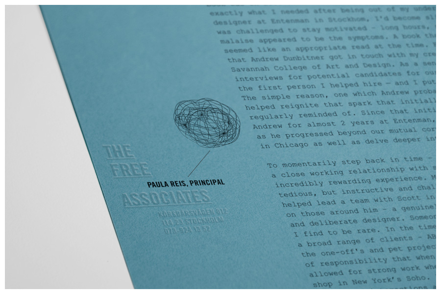
I like the logo-form in the corner, and the clear identity this creates. It has a very classic feel to it, that seems to be very in right now.

No comments:
Post a Comment