This is the first year's cover. I do like it's simplicity compared to the photograph on the front of the second year book (below), which doesn't say very much. The textured cover, bookrum/hessian/something similar creates a quite nice contrast between it's texture and the smoothness of the pages, which means that the cover feels like it contains the contents very well. I think with the theme of legacy, we're better off approaching the simple option rather than the photographic option. The second year's cover just doesn't say anything of our course, it's blank, rough and scrappy paper. To me personally, it doesn't feel like it sends out a very good message.


In terms of quotes from Fred, I think the second year's layout is stronger. The large 'B' against such a thin weighted type feels like it doesn't have enough presence. Where as the second one uses helvetica which has a lovely balanced weighting on the page. Personally, I don't like the banana yellow that is used in the first year book either.


Both contents pages are pretty nicely laid out, I'm not a big fan of having the horizontal blocks of text if there's a lot to read though, it makes the whole book less readable as you flip the pages round to try and read it. For that reason, I'd want to favour the much simpler layout of the first contents page.


Out of these pages, concerned with quotes from Lorenzo and Amber, I'm keen on the dynamic the change in font size creates for the pull quotes in the first year book. I also prefer black on white to the white reversed out on red in the second year book. However, I think in this case, there's little enough text on the column that runs vertical for it to be readable, and that's more interesting to me than the way the names are laid out on the first year book.


I'm not sure which of the two I prefer with the studio photos, but I think that both seem to work quite successfully. I think the clarity of the first photograph might make it feel a little more crisp to me.


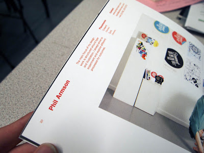
In terms of laying out the work and the photographs of the students, the second one is applicable to what we're doing, their identities are often obscured and they're interacting directly with their work, or at least on most of them. This makes sense to the idea of legacy in a way, the work is what is significant, the person themselves isn't so much. I do like the sense of fun the photos of the people in the first one bring, but I do think that the second year book's layout allows them to showcase their work a lot more. Also, I still have problems with the text running vertically, but it does create quite a nice dynamic between people's work and the text, clearly differentiating the two.


No comments:
Post a Comment