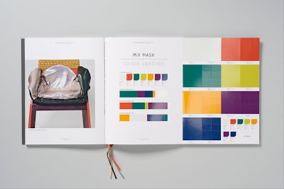
I thought this piece by Here Design was a good example of how a book can be separated into several sub sections. You have the main cover that folds out to reveal a series of spines to different books that are sewn together, categorised by colour and then a ribbon book marker with that colour is used to mark out where these subdivisions are in the book. It also has a rather excellent fold out (example bottom) which just makes the whole thing feel considered. This is something to be aware of with Garry's book, he's sending it out to other artists and printmakers, the kinds of people that would really appreciate the more unusual touches in book design.


No comments:
Post a Comment