Open publication - Free publishing

Friday, June 3, 2011
Thursday, June 2, 2011
End of module evaluation
To begin this evaluation, I will look at the strengths of my work, before identifying the problems that I faced and the areas upon which I could improve.
Firstly, I'd say I moved significantly in the right direction in terms of learning about typography and how to use it professionally. The briefs that aided this the most were probably the Fashion Year Book and my context publication. The Fashion Yearbook taught me so much about prepping a document professionally and ensuring all the tiny details (including the placement of typography) are consistent for the best finish.
The context book acted like a type 101 and perhaps replaced the type module that I regret I missed. It gave me a perspective on how the industry view typography (some see it as an art form, some prefer to see it as a science... the industry is moving increasingly towards a community-centric response to the issues of plagiarism etc.) as well as taught me about the fundamental uses and purposes of specific typefaces. For example, I had no idea that Avant Garde was designed entirely as a display font for a magazine, but it does explain why it looks clunky and uncomfortable as body copy as well as why it is overly rounded.
I think also, I selected a series of good briefs to work with, and arrived at conclusions that really helped me identify where I want to be in industry. I really do want to work with the culture sector and the briefs selected were all geared towards that. I had some really good experiences: the music zine brief and branding Les Morts were creative and fun and I communicated with a good client in the Les Morts brief (long time collaborator, Daisy) and got to talk to some interesting people in the DIY music scene as part of the zine brief. I've had bad experiences: The fashion yearbook is a massively compromised piece that is made up entirely of dictatorial decisions on the behalf of Sue and Paul. The team's creativity was stifled, creative decisions were forced upon us etc. But ultimately, I still want to look at this field because it is likely I'm going to experience the good and the bad in the professional world and if I get a bad brief with a bad client, then so what? I'm likely to find a good brief with a trusting client at some point in the future too.
Now, what did I do wrong/what could I improve upon?
Well, firstly, my time management and ability to deal with problems that came up quickly and efficiently wasn't as strong as I'd like it to be, which is a shame because I'd made a lot of progress with that over the course of the last module. Essentially, once I was burgled, it threw my ability to plan properly off a bit. I think it startled and panicked me and I never really recovered from that dreaded feeling of 'Oh God, I have so much work to recover before I can even begin to move forward). I also think that I had problems setting realistic goals, because the final deadline was so far away from where we started out, it was difficult to set a deadline for when something should be finished and stick to it. Now this would be a serious problem for a Graphic Designer in industry, however, I think it's because there were no quick and sudden deadlines that it kind of stymied my progress. In industry, with a series of shorter deadlines, I think I'd cope more easily and be able to plan my time more efficiently.
The smaller details: I like to think I've progressed a lot, and got some really good work for my portfolio too, but I still need to focus on the fine details of what I do. Sometimes the typography can be a little unrefined, or little alignment details are off and I need to perfect this if I'm going to work in industry. On another note, my crafting skills are appalling. I can never finish anything to a fully professional standard by myself. I just have clumsy hands. I'm looking forward to being able to send briefs off to a printer and they will finish the job to a professional standard for me.
I could also have worked a lot faster, but once again, I think that the extremeley long period of time for an ultimate deadline meant that I procrastinated and it meant that I found it difficult to stick to deadlines that I'd set for myself that weren't, you know. 'real deadlines'. When it came to 'real deadlines' like the fashion yearbook, I managed pretty well, unfortunately the client was really slow at giving us the necessary information to complete that brief which made it a mad rush that was kind of out of our hands.
In conclusion, I do feel like a better designer and one that is definitely a lot more ready for the real world because of this module, however, I would say that I'm still not the finished article by any stretch of the imagination. Steps to take: I think getting some work placements over the summer would be really beneficial to me becoming a better designer. I would have liked to have got placements before but I've never had the confidence in my abilities until now. I'm also going to spend some time just having fun with typography through more self initiated briefs, maybe not even ones for my portfolio, but ones that just let me work with the fine detailing of typographic work in a very short space of time.
Fashion Yearbook evaluation
Open publication - Free publishing
The fashion yearbook was another difficult brief, one that was lead far too much by the whims of the client who seemed unable to let the team, as designers, design. He constantly changed his mind, meaning that the changes to the design direction kept on happening. He limited the design to having one layout which made us feel a bit like the book was going to be dull. He often provided us with images and content way after the deadlines we had agreed with one another, meaning that the book nearly didn't get to print on time.
On the upside, I learned so much about prepping a large publication for print. About the relationship between client and designer (i.e. how I should manage a client in the future) and about the relationship between designer and printer (they're generally affable people who have your interests at heart).
I'm also satisfied with the final result, despite it being nothing like what I'd imagined and the difficulty of getting there. In terms of the way the three of us, myself Kate and Ross, worked... I think that although I started out being the project manager and was doing very well at it, Ross took up a lot of the slack for that in the later months as other briefs began to take over my life. I think myself and Ross were the ones that needed up doing most of the work, not because Kate didn't want to, but because there didn't seem to be enough room for her to be able to work as well, this is unfortunate but perhaps it's something that needs reconsidering for next year, because although it is a substantial undertaking, I think it could be easily and more successfully managed by 2 people instead of 3-4.
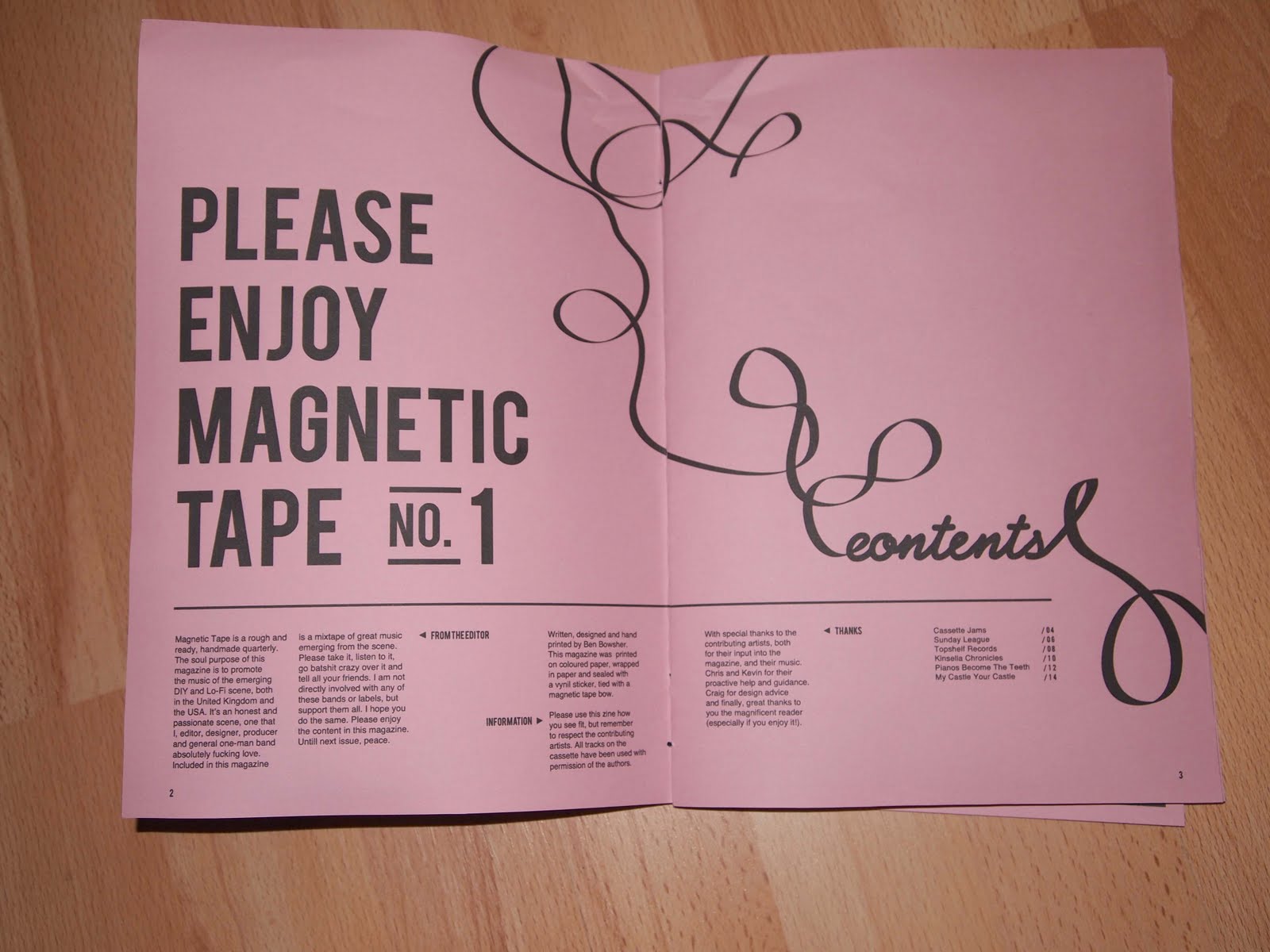
Magnetic tape/music zine evaluation
Open publication - Free publishing
Magnetic Tape was a labour of love and a final piece that I actually really enjoy. The real problem witht his brief was the fact that it's the first one I started and I spent far too long on it, although I'm glad of some of the revisions I made to it. Everything seemed to go wrong; screen-printing failed several times, the ink was inconsistent on the digital prints that I made (although I ended up using and photo-shopping these ones). I wanted to be able to produce a bunch of copies to actually distribute, but unfortunately this became difficult when the screens didn't seem to register properly, effectively upping the cost.
I think that the range of products, 4 issues and a blog is probably a reasonable amount, but on reflection I could have perhaps thought of a few more directions to take it in.
Kubrick Brief evaluation
Open publication - Free publishing
The Kubrick brief was a bit of a difficult one. I think that I produced some good work for it, although I don't personally find it visually where I would have normally ended up, the type treatments are pretty sound and the conceptual exploration through line weighting is a interesting idea, I haven't done anything that conceptual for a while.
I can't say hat I think it's the best thing I've ever produced, and it walks a fine-line between minimal and too bare at times. I think the most successful of the minimal elements is the tickets, they ended up working in a really satisfying way.
I also like the range of printed media that I managed to apply the ideas to. I wish I had the patience to mock them up into an environment, but unfortunately I'm at the point now where if I continue, I will make myself ill, I know when to call it.
Les Morts evaluation
Open publication - Free publishing
Above are the boards for this brief. I really enjoyed this brief and it allowed me to explore a variety of different printed medias and how to explore them typographically. it was also a subject that really interested me.
In terms of how I did, I think that this was quite a successful brief, and the 'cult-like' tone of it was captured quite well through little touches in the phrasing of things. I produced a large range of deliverables, whether physically or mocked up, I think you get a real sense of the direction this brand is going in.
My only real regret about this brief is that I couldn't print the brand guidelines, they would have been a very nice looking publication, but nevermind. I think there was always room to try more things out, but I'm pleased at where I ended up anyway.
Wednesday, June 1, 2011
Web banners
OK so running on very llittle time, I thought it best to quickly consider the digital application of what I've done with the Kubrick brief. Using primarily the ticket designs as inspiration I created these very quickly to go into the 728x90 px banner that is on the screen shot below. They work and are visible, I just wish I didn't have to rush this element quite so much, but then at the moment it's just head down work like a horse and hope for the best, time management is increasingly a worrying issue.


applied to the website:


applied to the website:

ticket manufacturing
OK so the ticket designs were printed on white card like everyhting else, although this is too thick a weight for tickets, which should normally be on astock that weighs 120gsm at the absolute maximum, I wanted a consistency of colour across everything that I printed for this brief. After cropping them, I perferated the edge of them to make it authentic:


I'm actually very happy with the results, they're the most interesting thing that I've designed this brief. Their simplicity is quite beautiful and immediate in a way.


I'm actually very happy with the results, they're the most interesting thing that I've designed this brief. Their simplicity is quite beautiful and immediate in a way.
Minor cover disaster
We had a minor disaster with the cover but it's alright now. Clive came in with the covers and they were smudgin requently, it was a concern and we tried some other paper stocks but they looked shabby. In the end Clive realised that he just needed ot leave them to dry for much longer than standard stocks and they would be fine, so a disaster averted. Phew!


magnetic tape blog
Kevin from topshelf suggested a blog a while ago. I got round to designing it at long last. It's all black and white like the issues and uses helvetica (arial if viewer doesn't have helvetica) as body copy like the issues do, so they tie together quite nicely.


I had to change the header fomr an older design that I had to this one keeping with the style of the zine:


Tuesday, May 31, 2011
Final context books
Here are my final context books. I'm really happy with them, unfortunately I left the actual production of these books a little late in the day.It means rather than trialing a load of different paper stocks to see which one would work the best, I'm goign to have to pick some stocks from the library. Not ideal but all my fault. I want two different colours of stocks: 1 that is a little lighter for the designers and type is art books so photographs stand out against them much better, and one thats a bit darker, to make the type manuals seem a little bit more industrial.
Belly band to hold them altogether:
So, how did this project go? pretty well and I found it very valuable as an asset in me growing as a designer. Both i terms of having the contact studios (even though a lot didn't get back in touch) in terms of getting to know and understand typefaces I've regularly worked with a lot better, and in terms of understanding type as a skill and a beautiful art form.
Weaknesses: I put this together a bit late in the day so it wasn't managed as well as it could have been I guess, but that's just the way it is sometimes.
Open publication - Free publishing
Open publication - Free publishing
Open publication - Free publishing
Open publication - Free publishing
Belly band to hold them altogether:
Open publication - Free publishing
So, how did this project go? pretty well and I found it very valuable as an asset in me growing as a designer. Both i terms of having the contact studios (even though a lot didn't get back in touch) in terms of getting to know and understand typefaces I've regularly worked with a lot better, and in terms of understanding type as a skill and a beautiful art form.
Weaknesses: I put this together a bit late in the day so it wasn't managed as well as it could have been I guess, but that's just the way it is sometimes.
Monday, May 30, 2011
Attempt at screen-printing zine, what to do next
OK, so I attempted to screen print my zine but it was rubbish! the black was more consistent, but I don't even like that and the type came out illegible, unfortunately someone took it upon themselves to bin/remove the stuff before I had time to photograph it, so I guess now what I'm going to have to do is stick with what I've got and photoshop them. Propose that the stock is similar, but not the same (inkjet friendly instead) and not actually mass produce this zine, think about doing that over summer if I get time.
Anyway, here are photos I took of all of the physical products photoshopped, they look ok and these are what I'll use for my boards. I wish I could get more consistent colour quality. I need to work with a photographer to shoot my stuff in the future!


Anyway, here are photos I took of all of the physical products photoshopped, they look ok and these are what I'll use for my boards. I wish I could get more consistent colour quality. I need to work with a photographer to shoot my stuff in the future!
First issue:


Future issues


Saturday, May 28, 2011
Boards, order
I have photographed all my work for this project, I just need to decide what needs to go on the boards:
board 1- concept audience, tone of voice (logo as splash)
board 2- logo, branding and typefaces
board 2- stationery
board 4- t-shirt designs
board 5- t-shirt packaging
board 6 - website
board 7 - advertising stratergy
board 1- concept audience, tone of voice (logo as splash)
board 2- logo, branding and typefaces
board 2- stationery
board 4- t-shirt designs
board 5- t-shirt packaging
board 6 - website
board 7 - advertising stratergy
Web identity
Open publication - Free publishing
Here are some proposals for the web identity, firstly a splash page with designs using the brand guidelines, white on black, black on white and white on pinhole photograph. I think that ultimately the pinhole photograph ties the concept together with the stationery more than the other two. This is followed by a few quick developments of how a website might look. Web design really isn't my thing and so I just tried to give an inclination of what it might look like tot he client, but there is room to tweak and change when this goes to a web developer over the summer. BUt it gives an idea of both how a page with a banner advertisement and then the catalogue might be laid out.
Friday, May 27, 2011
Advertising techniques
OK, so I needed to think of a realistic way to approach advertising of the company to pitch to Daisy. Basically, there isn't enough money to take out web banners, obviously... nor magazine adverts as yet. The best stratergy therefore is to approach the physical advertising virally, whilst using social medias such as facebook to promote the brand digitally.
The advantage of facebook is that you can meta-tag it, which means that facebook will recommend it to people with similar interests as those meta tags, meaning that I can reach my target audience quickly and efficiently:

Whilst the viral physical advertising is hopefully a way of making people feel inclusive in something secret, like a cult, etc. Anyway here are a few quick designs for posters, which are to be fly-posted around, they're supposed to be ambiguous and interesting and provoke a reaction of curiosity, the date on them is a date myself and Daisy have set to try and get things up and running, providing us with the summer to get to where we need to be with it:
Open publication - Free publishing

Thursday, May 26, 2011
Brand guidelines tweaks
I decided to remove the pinhole photograph cover, it looks at odds with the stark black and white of the rest of it and then I altered some layouts. I decided that calling it brand guidelines was a little dull, so I renamed it (oc)Cult Aesthetics, in keeping with what the brand is trying to do.
At this point I think it's important to also sya that I was going to print this off, but it's unrealistic to get a brand this small to print a load of copies of these to give to potential designers they're working with, instead a digital file is perhaps the better option.
Open publication - Free publishing
Open publication - Free publishing
At this point I think it's important to also sya that I was going to print this off, but it's unrealistic to get a brand this small to print a load of copies of these to give to potential designers they're working with, instead a digital file is perhaps the better option.
Wednesday, May 25, 2011
Design context book research.
I have to be honest, I did a lot of research for the 10 serif and sans serif typefaces on the internet without really recording what I was doing. This was a pretty stupid thing to do. I wasn't thinking, but it's very late in the day now and I can't dedicate time to tracking down every website I used. I will say that most of the information was found by googling the typeface and looking for profiles on it, and then also discussions and interviews on the typefaces. Where I've used quotes in the book, I have credited the source as I was going a long. I know this isn't ideal and its poor documentation but frankly this fmp is starting to grind me down and I just need to get on with it whilst having as little as possible limiting me.
Tuesday, May 24, 2011
Context book development
Here are some pdfs of the way the layout is developing. I managed to set quite a rigid structure earlier so it was quite easy to stick to it, mostly it was changing the way images were laid out and ensuring that the typography was type. Having quotes was a useful device and I'm grateful to all of the designers that I asked who contributed answers:
I used this template for the 10 excellent type designers book, so it was another case of pushing images around the page, so I haven't documented that, which is stupid really.
Open publication - Free publishing
I used this template for the 10 excellent type designers book, so it was another case of pushing images around the page, so I haven't documented that, which is stupid really.
Final Crit yesterday
OK so we had our final crit, here are a few photographs of the work I presented and the forms of feedback I got back.
Things I couldn't present: Brand guidelines book, on blog, Fashion yearbook (full colour proof was with Paul at this time) and the black and white spreads didn't do it justice so I referred them to blog.
Feedback I got was generally very positive, the only problems really, were sorting out the blog coherency in regards to the design context brief and making sure that certain things that have occurred are recored properly (I have some gaps of information that I haven't put up yet.) These are things i'm aware of, and I'm going to break OUGD303 DC into two tags; ougd303dc and ougd303dc BOOK, this will separate general research from when I'm starting to bring it all together and put it into my book.
Other then that, I feel confident that I'm moving towards the end of all of my briefs and it's just a case of getting everything printed and photographed ready for putting on boards. As well as getting the context book ready so I can begin printing on a few different paper stocks by the end of the week/beginning of next week.


Subscribe to:
Posts (Atom)