Open publication - Free publishing

Monday, February 28, 2011
Rough Contents page
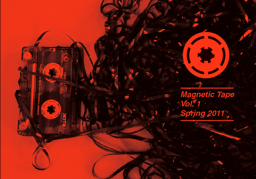
I quickly mocked up how the contents could look using the Michael Freimuth newspaper in the past post as quite a heavy reference point. The black behind the 'enjoy magnetic tape' bit isn't a black block, but is in fact a really heavily darkened picture of magnetic tape, this will probably come through on the print. I did this on purpose to avoid just having a continuously black background, hopefully it will create a bit of a grainy effect that will really suit the DIY aesthetic. It's just quick, but it's also just one direction, but I'm very happy with the structure of it.
music Zine Cover Designs, further development
I wanted to try writing with magnetic tape, and here is my poor results:

Terrible I know, the problem is the tape constantly wanted to recoil on it's self, even when glue, and so it wouldn't stay anywhere near legible. It took 2 hours to get a p and a t to work and another 30 mins to get the a and the e which then promptly recoiled to the sorry state you see before your eyes, so it's perhaps not something to do for this.

I made a drawing from it, and this is perhaps something I should explore but right now, I'm really wanting to push different things with the photographic direction I'd been working on.
So here are some things on the wide format, and then the thin format Anothe rthign to note is that because of the budget, I've decided to not use two colours but reduce it to black on stock:
Before writing about this, I think it's important to show a few things that inspired me directly:

I like the simplicity of this cover for hootenanny, a newspaper based on inspiration done by the university of Lancaster(?). I love the use of a larger letterform, and I think it's something that influenced the use of the large no.1 that's on the cover. I also really liked the use of lines to seperate the text and prevent it from looking like it's lost in the negative space, and I took that tool as well.

I love the simplicity of these posters by Raw for Chapel Street Studios, and I think the use of monotone on different colours is something to consider on as a way of differentiating between the issues. It looks very DIY and that's obviously something I want. I think the grainy photographs I've taken really help with this.

Finally, I like the artsy-ness of this newspaper designed by Michael Freimuth, as well as the quality of the blacks, which are both rich and grainy, so that's something I'm striving for as well.
I think that I prefer the thin format, it seems to look the most visually aware, something about the wideness of the other one makes it less visually appealing. Also, with the thinner format, it's less folds so I can get the full 16 pages onto one duplexed piece of sugar paper, this also means that I can fit it all onto two A1 screens which is twice as cheap as the other format, which is good if I am going to produce a run of these. In fact, that reminds me, I need to thoroughly budget this to avoid spending a lot of money (for a later post I feel).
I started playing around with the no.1 to emphasise that this is the first issue, using futura, which I liked from my previous initial designs for this. I liked the line boarders I used for it too, I feel that they give it a sense of structure that avoids it just hanging in the middle of the page. I also started creating a banner which sort of mimics the idea of tape a bit and allows me to place type onto the cover without the magnetic tape photograph intervening with it. This direction is quite swiss in a way, although the tape keeps it from being quite as minimal as the swiss, and therefore it gives out quite a sophisticated feel. I don't know whether this matters or not, other than it's visually engaging and it definitely says music. I think this is a strong direction, but I'm very aware I need to try a few more things first.

Terrible I know, the problem is the tape constantly wanted to recoil on it's self, even when glue, and so it wouldn't stay anywhere near legible. It took 2 hours to get a p and a t to work and another 30 mins to get the a and the e which then promptly recoiled to the sorry state you see before your eyes, so it's perhaps not something to do for this.

I made a drawing from it, and this is perhaps something I should explore but right now, I'm really wanting to push different things with the photographic direction I'd been working on.
So here are some things on the wide format, and then the thin format Anothe rthign to note is that because of the budget, I've decided to not use two colours but reduce it to black on stock:
Open publication - Free publishing
Open publication - Free publishing
Before writing about this, I think it's important to show a few things that inspired me directly:

I like the simplicity of this cover for hootenanny, a newspaper based on inspiration done by the university of Lancaster(?). I love the use of a larger letterform, and I think it's something that influenced the use of the large no.1 that's on the cover. I also really liked the use of lines to seperate the text and prevent it from looking like it's lost in the negative space, and I took that tool as well.

I love the simplicity of these posters by Raw for Chapel Street Studios, and I think the use of monotone on different colours is something to consider on as a way of differentiating between the issues. It looks very DIY and that's obviously something I want. I think the grainy photographs I've taken really help with this.

Finally, I like the artsy-ness of this newspaper designed by Michael Freimuth, as well as the quality of the blacks, which are both rich and grainy, so that's something I'm striving for as well.
I think that I prefer the thin format, it seems to look the most visually aware, something about the wideness of the other one makes it less visually appealing. Also, with the thinner format, it's less folds so I can get the full 16 pages onto one duplexed piece of sugar paper, this also means that I can fit it all onto two A1 screens which is twice as cheap as the other format, which is good if I am going to produce a run of these. In fact, that reminds me, I need to thoroughly budget this to avoid spending a lot of money (for a later post I feel).
I started playing around with the no.1 to emphasise that this is the first issue, using futura, which I liked from my previous initial designs for this. I liked the line boarders I used for it too, I feel that they give it a sense of structure that avoids it just hanging in the middle of the page. I also started creating a banner which sort of mimics the idea of tape a bit and allows me to place type onto the cover without the magnetic tape photograph intervening with it. This direction is quite swiss in a way, although the tape keeps it from being quite as minimal as the swiss, and therefore it gives out quite a sophisticated feel. I don't know whether this matters or not, other than it's visually engaging and it definitely says music. I think this is a strong direction, but I'm very aware I need to try a few more things first.
Music Zine Format
Here I have quickly folded down the sugar paper in the library to see what formats you get out of just folding it down, which will make producing 20 copies as quick and cheap as possible. You get either this wider shorter format (355x255mm), or by folding it again you get a longer thinner format (175x255mm) So I'm going to work with both and see which works better.


Finally, I put it in a comic wallet as a possible way of packaging, although I've done this before with the conspiracy theory book in last module and want to try something more unique (yet still cheap)


Finally, I put it in a comic wallet as a possible way of packaging, although I've done this before with the conspiracy theory book in last module and want to try something more unique (yet still cheap)
Fashion Yearbook Covers
I've had this idea bout the covers for a while, where photography would be used. We've all agreed that the book should work in a similar fashion to the way it did last year, with a cover that allows the book to read from back to front as well as front to back in order to divide the pathways up. The photographs would then represent each of the separate pathways, pathway A Fashion and Innovation is also about branding, so for that photograph it'd be good to have bags, labels, a macbook... all the things that help with branding. For pathway B Fashion and Design, which focuses mainly on garments, something similar to the photograph I've used would be good.
I found this photograph through google search and it was originally an Ikea advert, I just removed all the ikea junk. I think the tonal quality of the photo definitely says high fashion.
Open publication - Free publishing
I found this photograph through google search and it was originally an Ikea advert, I just removed all the ikea junk. I think the tonal quality of the photo definitely says high fashion.
Fashion Year Book Inside layout development
Today I worked on the fashion yearbook for most of the day. Initially I focused on the layout of the inside of the book, and how it would work with the logo I've been developing (previous post). Here is a PDF of the things I tried out today. I'm a big fan of the writing being vertical, rather than horizontal. I know I said I didn't like this about our yearbook from last year, but it creates a sense of progressiveness that both suits the logo and the idea of fashion as constantly forward thinking.
I think that the 'Nouvelle Vogue' font needs to be kept reasonably to a minimum. It's a nice header font, but it shouldn't dominate the work, because it's quite an illustrative font. When I used it for even larger quotes, it became too much. For this reason I stuck with futura for most of the other text. I chose it when designing the logo for the 'BA fashion' and 'leeds college of art...' bits because it's pointedness and thin weight seemed to go with the nouvell vague more than other fonts like helvetica, which appeared far too blocky.
Obviously, it's going to be easier to see the actuality of the design when we recieve some actual photos, so that's something to bring up at the meeting with Paul on wednesday 2nd. But thus far, I feel this direction is definitely heading in the right way.
Open publication - Free publishing
I think that the 'Nouvelle Vogue' font needs to be kept reasonably to a minimum. It's a nice header font, but it shouldn't dominate the work, because it's quite an illustrative font. When I used it for even larger quotes, it became too much. For this reason I stuck with futura for most of the other text. I chose it when designing the logo for the 'BA fashion' and 'leeds college of art...' bits because it's pointedness and thin weight seemed to go with the nouvell vague more than other fonts like helvetica, which appeared far too blocky.
Obviously, it's going to be easier to see the actuality of the design when we recieve some actual photos, so that's something to bring up at the meeting with Paul on wednesday 2nd. But thus far, I feel this direction is definitely heading in the right way.
Fashion Photography
I have an idea bout the book utilising photography for the covers. Here are some high fashion photographs, all of them have elements that I'd like for this year book.

I like the softness of the colours that make this look almost retro, along with a really strong 1 colour that pushes through. A photograph that is strongly one colour will be helpful for a cover, because it makes it more predictable when putting type over the top, making picking a font easier.

This isn't a fashion photograph, but again I like the soft, almost pastel shade that the photograph holds.

Presence of one colour, plus the naturalness of the background, i.e. it's not on an infinity curve are the attribute which I'd take from this one.

This ikea one is almost perfect, it contains similar objects to the ones that I'd include on one of the covers for the photograph, so this is something that might be worth showing to Paul when presenting the direction that I'm thinking of going down.

I like the really strong colour in this, obviously it's not something that's feasible with the timescale and budget we have for this yearbook, nor is it something I'd want to copy.

Again, really strong colour.

Very strong colour, plus I really love the background, it's a nice naturalistic setting and something similar would be appropriate to the photoshoot I'd want to do as part of this direction I'm working on.

Good example of strong colour presence and some nice type (the main header) and some awful type (subheader and author name)

I like the retro vibe of these colours, it looks like a warn down polaroid.
The following three I like for the same reason, soft colours and retro vibe.


Thursday, February 24, 2011
Managing the project
I formally have adopted the role of project management which is scary, but I feel really up to the task. Because of this, there are some further things I need to bring up with Paul in a meeting we have on Wednesday 2nd of March at 2pm, just to ensure everything is heading in the right direction.
Firstly:
-Need a figure for the print run they want
-Photography- They need to start contacting a photographer, I have one that I highly recommend, Adam Fussell When I designed t-shirts for Daisy over the summer, he took the photos for the product shots and they were amazing, he's also done shots for han cholo which are really good. I'll recommend it's worth getting hold of him.
-He needs to set a date for the photography shoots, so I know the deadline I can work to.
-I need the students to give me or him 30 words about themselves, their web addresses, emails and work numbers, so I have content thats ready to put into the book.
-I need a quote from himself, Sue, any other team members and the workshop team about the course.
-This needs an appropriate deadline, a week maximum, so we have all the written content at once.
After this, we can pitch the different things that myself and Ross have been doing seperately. I'm really keen on the stuff I've been doing and hope that my direction gets chosen. Hopefully there won't be too many modifications necessary.
I also tried to work out roughly the amount of pages, so we can start getting estimates as soon as possible. (once we decide on a few different paperstocks and look at finishes and none finishes.)
Here are the pages:
Contents x 2
pathway information x 2
52 student double spreads
message from sue (single page) x2
message form paul (single page) x2
message form other tutors (double spread) (in the middle)
message from workshop team (double spread) (in the middle)
List of students/headshots of students x 2 (slap bang in the middle)
rough estimate of 128 pages.
Interviews for music zine, 2
Copy of email interview with American label topshelf:
Thanks dude! Will this be posted online anywhere? I'd really love to have an online version as well to share with people if possible. Either way. Interview's below!
-Kevin
On Feb 23, 2011, at 2:40 PM, Ben Bowsher wrote:
Hi Kevin,
Sorry this has been a while, I've just been swamped with some other stuff, but I've just got some questions together. Thank you very much for doing this, man. I hope they're OK, feel free to go on as long or as little as you want. Also, if it's OK with you, some of your answers might lead to some more questions, so I might email you some more.
OK, so firstly, For those people who might be unaware of Topshelf, could you just outline who you are and what Topshelf does?
Hi, I'm Kevin and I co-run Topshelf Records with my friend Seth. Topshelf Records is an independent record label out of Boston, Massachusetts.
What made you want to start a record label?
Topshelf was first born out of necessity as a means to help promote and release music from bands that we were playing in at the time. The scope grew as we started releasing our friends' music as well. So, basically, we started this to get our music and that of our friends heard outside of the New England basements it was currently confined to.
Who growing up, do you feel influenced your current musical tastes now?
I never really had a "big brother" figure or whatever so I've always been very independently minded when it comes to checking out new things; sometimes to a fault even, haha. Your peers and local scene (if you're fortunate to have a good one) tend to be big influences for your music tastes and this was no different for me growing up. If I had to get specific. I'd say Saves The Day's "Stay What You Are", Braid's "Frame & Canvas" and Toe's "Book About My Idle Plot On A Vague Anxiety" all left the most lasting impressions on me.
Do you have any advice for people who maybe want to start releasing their friend's music?
Key word there is "friend". One of my favorite aspects of Topshelf is how the vast majority of our roster is comprised of really good friends. I think it's important to start simple and not try and do too much. The rest I'll sum up with a quote from one of my favorite DIY labels while growing up (Said Sew Recordings): "A job is work but work isn't necessarily a job. Stay busy in the daylight, stay busy in the moonlight, and don't worry about the limelight."
All of the bands you have put out are part of the DIY scene, would you consider yourselves a DIY label?
Considering Seth and I manage nearly every aspect of running the label in our (ever-shrinking) spare time; definitely. I realize there are labels that might tout the DIY ethos more prominently than we do, but I think there's no question if you're doing this type of thing, sure, you're very much engaged in a DIY operation.
Do you find it hard to balance the idea of being commercially viable as a business with the principles of DIY music?
Not really. We've been doing this for five years now and I think we're finally at a point where we've married the two just about as happily as we can. I think it goes without saying that people appreciate having principles placed over commercial viability. I suppose that _is_ our commercial viability, ya know?
How do you go about releasing band's records, do you approach bands, or are the releases brought about through friendships?
I think there are clear stages in which labels grow in terms of expanding their roster and working with new bands. At our core, we'll always be working with new and old friends alike on projects — I don't see that ever changing (and the day it does, I quit). I think once the label's grown some and has some attention, that's maybe when you start branching out and maybe working with friends of friends; or bands whom you don't necessarily know, but appreciate, respect and enjoy. Caravels, for example, is a band that was repeatedly recommended to us through bands on our current roster after having played with them... so it just made sense to get in touch and see if we could potentially work together.
Are there any bands you haven't had release a record on your label that you'd kill to put a release out for?
Oh, haha, SO many. There'd be a lot of dead... are we talking people here? ... Yeah, fuck it. A lot of dead people. Haha, we'll see. We've grown a lot more brash with regard to getting in touch with bands about working together over the last couple years so who knows what might happen.
With this scene seemingly starting to gain some momentum, do you have concerns about it becoming popularised? Where the sound is similar but the value becomes lost, or do you not see that happening?
As I see it, we're riding the crest of a second wave of several genres which have already gone from obscurity to popular and back again over the course of the late 90's to mid 2000's or so. I mean, all the while plenty of bands have kept on keeping on. But yeah, to be honest, I dunno or too much care where it's headed. If a band's talented, passionate, hard-working and authentic we want to work with them whether this gets popular or not.
Do you see there being a difficulty between creating this strong and open sense of community and maintaining the core ethical ideals of the scene?
I've given this question (or some version thereof) some prior thought, actually. I gotta say, to this point at least, I feel like most everyone "gets it" and is very in tune with fostering this thriving national (multi-national?) DIY music community. I really am seeing a lot of positive stuff everywhere in the way of support for bands and showgoers alike. This is really evident on a lot of online communities and in real-life context at VFW or house shows. Bottom line, I think people gravitate to a community like this because it has such strong ideals... That being said, I'm sure there's a critical mass at some point. What a shitty answer, haha.
The creative output and variety of the label is impressive, do you think you'll diversify what you put out even further?
Though I think we've definitely found a niche for ourselves, it's an open-minded niche. I feel like there's so much room for diversity in our roster and that's a great thing. We're certainly not actively looking for any specific genre and I place a good deal of pride in the fact that we don't need to.
You recently celebrated a 5 year anniversary, what do you consider the greatest achievement of your label so far?
Getting to celebrate a five-year anniversary, haha!
And what was the hardest thing you've dealt with in the past 5 years?
This past summer we invested a lot of time and money into a compilation CD project for Warped Tour 2010. The pressing plant we chose to go through botched the project entirely and then closed down without any warning. This left us out on the road and committed to a tour with barely anything to sell. We were losing money most of the Summer and had to pay through the roof for rush production and delivery costs through another pressing plant to get our CD's to us to sell. It was a nightmare. Heh, I think we learned a lot from that though!
What excites you about looking at the possibilities of the next 5 years?
I don't even know where to start! There's a lot to get stoked on. Mostly though, it's just the continued growth of the label and having all of the bands we work with benefit as a direct result. It's making me really happy to see a lot of our friends succeed at what they're doing.
Some of the bands you've put out I really love, Pianos Become The Teeth and The World Is A Beautiful Place... in particular. Are you aware of the respective scene emerging in the United Kingdom? And if so, are there any bands in particular you'd love to sign?
Thanks, they're both really talented for sure. It's tough to gauge what's going on from over here, but in keeping tabs on Big Scary Monsters, Holy Roar, Faux Discx, etc. I can definitely tell there's a lot of cool stuff happening over there. While I don't think we're quite at a point to be extending ourselves overseas too much, bands like Tall Ships, Enemies, Adebisi Shank, run, Walk!, Super Tennis (R.I.P.), Pennines, Rhodes, This Town Needs Guns and Talons (whom we have actually worked with before) get me pretty pumped.
Cheers dude!
Thanks!
One last thing, I'd really like to put a high res image of you and seth in with the feature, I don't suppose you have one you could send me?
http://www.topshelfrecords.org/kevinduquette/big_cartel_photos/IMG_9254-final.jpg
They gave me some really good answers, and with a photograph and all the copy I can go straight into design ing these layouts, content included, which is a massive advantage over having to dummy copy everything up.
Interviews for Music Zine
So here are the questions for my interview with Chris from Sunday League:
Hi Chris, I’ve finally prepared some questions for you, any problems, let me know ASAP:
Firstly, for those who are unaware of Sunday League, just outline a little bit about the band, when you started, releases etc.
In terms of the scene that is emerging, there seems to be a strong ethical backbone to the bands emerging, do you feel the band has certain ethics, and if so, do you feel these influence the way you record and perform?
What other bands really influence you and why?
Vocally, I get a real ‘Kinsella’ vibe, if you could chose one of their bands to listen to on repeat, which would it be, and why?
When you write your songs, is there a regular process to how it works?
You recently had to replace your drummer, with Joe having moved to London. How is the transition to working with Steve? How do you feel he’s affected the writing process?
You write the lyrics, are they influenced by the music the band present you with, or are they pre-written and you work them to the song?
When you play live, often you don’t face the crowd, the band face inward instead, this creates a sort of anonymity between yourself and the crowd, Is it a conscious decision to almost become a member of the crowd, watching the band play?
You do a lot in terms of arranging gigs for other bands to play with you, do you feel a real community vibe, or is it difficult to get along and arrange gigs?
Finally, I heard you recently arranged for Algernon Cadwallader to play a matinee show in Newcastle in July, they’re a big band in the American scene. You must feel quite privileged. Do you feel a sense of international community? And do you plan on trying to get more bands from across the band to play over here?
Here are his responses:
1
Sunday League started as Foxy, Mark, myself, and Joe. We started practicing/writing in early 2010, with the sole intention of doing a 'Cap'n Jazz band'. We started playing shows shortly after and put out our first demo, entitled d(Emo), shortly after that. In September, Joe moved to London to do his third year, and we went on a break. We played a show while Joe was home for Christmas, and spoke to him about us maybe getting a new drummer, which he was totally cool with. So then, we got Steve.
2
Thinking about band ethics, we are strictly DIY. We each have backgrounds in the punk/HC scene, and I guess that's where it comes from. In terms of how it influences where we are as a band, it's paramount; From putting on our own shows to the production of D(Emo). It was completely in house, from recording and engineering to manufacturing of packaging. It's a little rough looking (And sounding) but it's honest. I think DIY ethics in music and honesty in music go hand in hand.
3
We are totally an influence-driven band, simply because we all love this stuff, haha. Our influences are pretty far reaching individually, but I think collectively, we're generally just trying to copy Algernon Cadwallader and Cap'n Jazz, with a bit of Snowing in there. We really like Hall & Oates and Rihanna too.
4
One Kinsella band- Cap'n Jazz, hands down. I have love for all of the Kinsella bands, Joan of Arc have a bigger back catalogue and American Football are pretty fucking magical, but it has to be the Cap'.
56&7
Our process, if we have one, generally starts with Foxy- he'll play us something sweet on his Beatles guitar, and we agree that it's really good. We then hash it out in practice, and speed parts up and slow other parts down, until it sounds just right. From my point of view, I generally write the vocal melody at practice during these sessions, but the actual lyrics are generally always changing. They might start with a line or a passage I've been playing with for a while, and go from there, but I don't really 'finish' writing songs, I just let them swim free, haha. I just consider myself really lucky to be hanging with such good musicians, Joe was amazing and Steve is dynamite too. He's only been in the band about a month and he's already tight as shit.
8
When we play live, I don't face the crowd, and I sometimes worry that it might come off as arrogant or rude, but honestly, it's simply because I get nerves, ha. I read once that when Fugazi (Or it may have been Embrace) played live, they went through a phase of facing each other, forming a circle. I like that idea, keeps my face out of view, haha.
9
We put DIY shows on before we started Sunday League so putting shows on for our own band was only an eventuality. Again, it just comes down to loving music and wanting to perpetuate momentum for a scene we'd love to see blossom.
10
Yes, the Algernon show! We're very excited about this one. Algernon, as I said, are one of the biggest influences for us as a band, and the thought of playing with them and putting them on is crazy. It's July 24th, and we have possibly one of the sickest line ups in the UK right now if you're into this kind of thing.
I'd say there are definitely close links between the scene which has been bubbling in the States for a while and the currently blossoming UK scene, with more bands being booked from the US and more home grown bands popping up all the time. I think there will definitely be more US bands over here soon, I'm kind of keeping my fingers crossed for a Snowing tour this year, haha.
Thanks Ben, awesome questions!
So yeah, with this I can start making up some layouts, he's getting a new band photo together, so I should have a nice high-res image to work with.
Wednesday, February 23, 2011
Typography development
In terms of the typography, I was really inspired by this fashion book that Jonny brought in, it uses a slab serif that is Gold foil blocked. I'd really love to be able to use a foil block too, but we'll have to see about the budget and get quotes.

Anyway, here is some mucking around with type. I used Nouvelle Vague at first before trying some others and returning to Nouvelle Vague because the shapes of some of the thicker stems are realy curved and almost sensual, which I feel really suits fashion.
And it's part of the high-fashion visual language, or at least I feel it is, referring back to THIS context post.
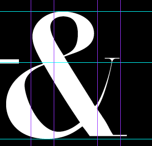
The problem I face with Nouvelle vague is that it doesn't have an ampersand in the font, so I used Bodoni, because it's a loose fit, and then modified it like so:


Then I made sure the ampersand height was the same as the header line so there's a nice symmetry and volume created


Anyway, here is some mucking around with type. I used Nouvelle Vague at first before trying some others and returning to Nouvelle Vague because the shapes of some of the thicker stems are realy curved and almost sensual, which I feel really suits fashion.
And it's part of the high-fashion visual language, or at least I feel it is, referring back to THIS context post.
Open publication - Free publishing
The problem I face with Nouvelle vague is that it doesn't have an ampersand in the font, so I used Bodoni, because it's a loose fit, and then modified it like so:

Then I made sure the ampersand height was the same as the header line so there's a nice symmetry and volume created

Saturday, February 19, 2011
initial cover designs
Ok so here are a series of designs I've done both using the photo composition I took initially and a far more basic, build-esque design. I think that the photographic composition suits the style of the music a lot more, and in terms of the typefaces that I've used, helvetica and futura seem to work the most because of their simplicity and immediacy. I tried a few different slab-serif fonts, like onyx, nouvelle vague and p22 Albers, but they're very 'in' in fashion magazines right now, so I'm worried that tonally it's going to come across as more of a fashion magazine if I use one of those fonts, although nouvelle vague is a very attractive font. I think there's a few more things I could try photographically, including using a band photograph, and making type from actual magnetic tape, so I'm going to go back to using my camera and try that.

Too stripped down and emotionless:


Effective:


Too fashion:


Effective:


Using 'multiplied' coloured objects to create illusion of tape, I think this works in an interesting way:


Again, too emotionless:


Too stripped down and emotionless:


Effective:


Too fashion:


Effective:


Using 'multiplied' coloured objects to create illusion of tape, I think this works in an interesting way:


Again, too emotionless:


Subscribe to:
Posts (Atom)