Friday, April 29, 2011

Actual Pain

This brand is form America and do a similar thing, I guess what's key is making my business distinctive in terms of the designs I use and the look of my identity. I think there's some great designs here, but not everything is brilliant. If you go to their website, the design of that sin't amazing either, so there's room to beat the competition at least in design terms.


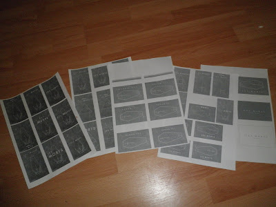
Test print pastel stocks

I found these pastel stocks that are similar to sugar paper, but a weightier stock and a higher quality. They come in various different pastel shades, which allows me to pick 4 and use one colour for each quarterly issue, which lets them work as a set but have an individual presence for each issue. It also keeps the cost down very low, which is what I need if I am to be producing a few copies of these things.

The problem with it was that it didn't respond to inkjet ink so well. however, I am confident that it will respond to screen-printing a lot better. Here are some photographs of the results and the problems with the finishing quality to it. Despite these problems, I have to say I really like the way it looks and I'm very proud of it as a piece.


Thursday, April 28, 2011

Influences behind Les Morts

Here is some of the imagery that kind of influences the visual style I want les Morts to have. Old and grainy photography, occult signs and symbols, free masonry etc.


Book covers final development

Here are the book covers as a whole including a spine and a back cover. It didn't take long to develop these I think what makes them successful is having the stripe of colour run from the front along the spine and all the way across the back. this element allows the individual book form the series to be recognised by its colour code., but I want to make sure that these translate well by doing a few proofs and making some modifications from them.

Wednesday, April 27, 2011

Sticker designs

Here is a quick series of designs for a sticker to stick on the black tissue paper that the magazine will be wrapped in. The difficulty is going to be getting a close match of colours for these stickers and the paper. I think stylistically, they fit very well with the zine it's self.

Poster to go with zine

So I thought it would be nice to have a little poster to go with the zine using a similar style as the zine; simple typographic communication. I thought about what my audience would want, and although my zine deals exclusively with DIY bands it doesn't demonstrate a lot of DIY ethics vocally, so I thought I'd generate some kind of rallying slogans that people can get into or at least put on their walls. So here is my development for that;


And here are the final selected posters: One for each issue. I decided not to include the magnetic tape logo because full on branding something is not a very DIY way of doing things, which is why the 'branding' looks so minimal in the first place.

Colour Choices and some changes

Firstly theres a chage to all of the book covers, I have decided to change the futura at +200 leading for Gill at no increased leading. Gill is quite a formal sans-serif that gives off the right signals of academia that suit the book.

Something else I changed regarding the stephen spielberg design, I changed it form vertical lines to circular outlines because otherwise it would look a little similar to the Wes Anderson pattern design.

I decided to look at tertiary colours for Stephen Spielberg, i.e. mainly browns, this is to represent the mix of different genres that Spielberg has worked with, and it also gives a unique colour that isn't similar to any of the other ones that have been used so far.

I've also started messing with the colours to get the right shade


Now to design the rest of the covers before printing proofs and making some judgements absed on those.

Tuesday, April 26, 2011

Initial responses to feedback form daisy, plus pinhole photography

After the logo feedback I got from my business partner Daisy, I combined the lgo elements she liked into the type below, which I'm really fond of. I whacked the leading up to 800 as well, because I liked that about the last page of logos I showed her and I think it's really effective. I wasn't so keen anymore on the background style, so I looked at pinhole photography on flickr: http://www.flickr.com/groups/pinholers/pool/with/5550227472/ .

These are some of the most interesting because they're quite ghostly and ethereal, they suit the idea of les morts quite well, and the brief concept of 'occult' 'black magic' 'ghosts' and 'the unexplained'. I used the delete brush with a series of grunge brushes to soften them into the photograph and push the ghostly ethereal look even further. I'm going to show these to Daisy and see what she thinks and hope I get permission to use them, particularly the black and white photography, I can see that applied to business cards and look books and looking pretty excellent.


Printed samples taken to daisy

I printed the logos I'd done and taken them to Daisy, I was happy with the times new roman type treatments and coffin icon but not the other symbols I tried out. Daisy was in agreement, she selected the image below marked with a red cross, but also liked the '{' I'd placed above an image so I incorporated into another logo. She also preferred portrait to landscape. These are things to consider and revise. I also want to try applying it to weird black and white photography, perhaps of occult ceromonies and rituals if I can dig any up.


Friday, April 22, 2011

Initial Logo exploration for Les Morts

Based on the visual style I have developed for both the Ouija design and the alpha/omega design from ages ago, here are a few experiments with logos. I have tried a variety of typefaces, including futura, gill, univers, baskerville, caslon, times, times new roman and scotch roman. I have experimented with increasing the leading and have found 800 to be appealing, it has quite a high fashion-sophistication about it that I want to capture. Originally I tried playing with making the type a bit symbolic, and although I may touch o this again, I probably won't go near it.


Thursday, April 21, 2011

I found this article on typography relevant to what I'm looking at in terms of context at the minute:


http://artequalswork.com/posts/abused-typefaces.php


Some typefaces aren’t bad: they’re just poorly applied. Some are so useful, they become ubiquitous, and others are just completely devoid of purpose. I like to think of typefaces more as tools of communication, with specifically designed purposes, rather than objects of art. By regarding typography as a tool, you can focus more on the intended function of a particular typeface, allowing for a more appropriate application, and generally, a more successful communication. Here are some of the most ubiquitous typefaces used in design these days, and how each is used, abused, or can be properly avoided.

Times New Roman: The Underdog

Times New Roman could easily be considered the most successful typeface of all time. Within a few years of being commissioned from Stanley Morison (with Victor Lardent) for The Times newspaper in 1931, TNR was the most widely used typeface in the newspaper industry, seeding its massive popularity 60 years before it was ever packaged with Microsoft products. One of the safest bets in the world of design these days, though, is that in any “properly” considered piece (except newspapers), the type setting will not be in Times New Roman. The mindset persists, with designers, that if TNR is a default typeface (as it is in the majority of software), any designer worthy of firing up an Adobe product should be able to explore options beyond the default. Is popularity, though, really a sound reason to banish a typeface from our type libraries?

TNR has enjoyed such a wide application for a reason. It not only revolutionized the newspaper industry at its birth, but it has survived on the merits of its design to out-live its original medium, and extend its typographic legacy long in to our digital times. Default or not, Times New Roman continues to be used in fresh and interesting new ways, and serves as a consistently solid serif choice in both print and web-design.

Suggested Usage:

For further examples of Times New Roman’s continued relevance, check out this article by David Shea, and take a look at how Coudal Partners have successfully utilized TNR for their site.

Helvetica: Mr. Popularity

If we’re still betting on typography, the second safest bet in design today is that in any given design piece, Helvetica has been used somehow. Helvetica has been, and continues to be an immensely popular typeface. Heck, like any good celebrity, it’s even had a movie made of its life. First drawn in 1956 by Max Miedinger, and based on Akzidenz Grotesque, Helvetica’s forms “evoke uncultivated strength, force and persistence”, as Robert Bringhurst has described it in The Elements of Typographic Style. Given these attributes, it is no wonder why designers have applied Helvetica to everything from subway signage, to toothpaste ads, to web pages.

But are all of these applications appropriate? Mr. Bringhurst goes on to say that even the lighter weights of Helvetica, issued in more recent years, “have done much to reduce its coarseness, but little to increase its readability.” The fact is, Helvetica, and its recent incarnation Helvetica Neue, are primarily successful as display typefaces, used best in headers and signage, not body copy. Therefore, Helvetica, as a tool for any typographer, is seriously limited.

Suggested Usage:

Helvetica’s not-too-distant cousin, Arial, is actually much more adept in the areas that Helvetica is weak, since Arial was designed for better readability at small sizes and on the screen. Like Times New Roman, Arial is also an unfortunately overlooked typeface, and many designers ridicule its homeliness, while negating its usefulness as a body copy workhorse. But by combining Helvetica and Arial, and utilizing each for their specific strengths, both can work in tandem to achieve a typographical success.

Copperplate: The New Black

Banks, steakhouses, law firms, and auto-repair shops… Copperplate has been used for all sorts of purposes, and has fastly become the de facto typeface for any piece that requires an air of establishment. Designed by the enormously successful typographer Frederic Goudy in 1901, Copperplate Gothic was intended to be set at small sizes on letterhead and business cards. Today, Copperplate has become the typeface of the modern suburb, assuring consumers that businesses of every sort are worthy of their money.

Copperplate’s sharp serifs work well to aid its readability at smaller sizes, but also seem to be misunderstood as giving the characters an old-world, stable ambience. The main distinctive feature of Copperplate is exactly why it has become so attractive to designers, and is exactly why it fails as adisplay typeface. The pointy serifs, at larger sizes, create distracting hot points at the ends of the letter-forms, severing the relationships between each letter, and forcing each character to be read individually. This destroys readability, and when Copperplate is overused, the effect can become quite nauseating.

Suggested Usage:

Keep it small.

Serpentine: Why?

I see the growing popularity of Serpentine as heralding the eventual descent of the Western world in to utterly encompassing idiocy. In fact, I cannot view any piece utilizing Serpentine without thinking of Mike Judge’sIdiocracy. Unleashed in 1972 by Dick Jensen for the Visual Graphics Corporation, Serpentine has a few weights, but only one speed: maximum warp. But even with its overly emphasized, horribly distorted letter-forms, Serpentine has its place. And for the love of all that we hold sacred as designers: keep it there.

What kind of a prison should we keep this beast in? One contained within the four walls of NASCAR, Professional Wrestling, strip clubs, and all-night discos. Anything including and related to these establishments have full reign to use Serpentine. Everything else must please find some other way of trying to convey speed, power, aggression, or machismo, unless you wish to do so in the cheapest fashion possible.

Suggested Usage:

Other type families to consider, besides this plague: Akzidenz Grotesque, Univers, Eurostile, or anything else bold and italic.


I suppose what it's saying is, that typefaces that I may value less are actually significant and have unfortunately been sullied. This isn't their fault and I sholdn't let it taint my perception of them, but perhaps look for the beauty and art in these typefaces.

Les Morts

I was recently approached by Daisy (collaborated on a few things before) to design another t-shirt with a similarly morbid theme and approach to the work. I decided to work with a Ouija board idea, it being a supposed vessel to communicate with the dead. For some reason I decided to do it in French, perhaps to romanticise it a little bit and avoid using the English; 'Yes' 'No' and 'Goodbye' which feel a little dull on a design. Anyway here it is, and it will go into print production next tuesday. Final touches were to add a slightly textured etheral background in order to create even more of a spiritualist vibe to the t-shirts.


Whats significant about this, is that it has begun a new way of thinking about my fmp and my practice in general. This stuff is something I really really enjoy and I've neglected it, so I'm going to use this piece as a springboard to start a company with Daisy called Les Morts (The Dead) and start a brief tagged 'les morts' which will be the branding, the website and t-shirt and garment designs, plus a look book once all the designs are printed and laid out. In order to do this, I'm dropping the Mario Merz Exhibition brief, I haven't started it yet, it's self initiated and I don't have a passion for it like I do for this brief.

Here's the brief:

Sunday, April 17, 2011

Important update

It's been a bit of a gap with posting about the year book, we're still awaiting the list of people and their biographies, which will allows us to star working on the final thing, rather than just with proposed spreads. Paul is increasingly difficult to work with in that his time management isn't brilliant, nor his organisational skills. This means that our team feels like we're constantly playing catch-up. We have the spread layouts and cover designs approved, we are just literally waiting for the information to arrive.

Another thing to note, Jonny is coming under increasing strain with his rationale, he doesn't feel he can continue to do this and justify it in his rationale. It's looking increasingly like he might have to leave the project. This is fine and agreed with the rest of the team because we're at a stage where it's ready to go if we get the information and the work can be divided by the three of us quite easily. It's a shame but I thin it's bets all round and I'm glad we've sorted it out amicably and efficiently.

Researching typefaces.

For my context publication, I want to look a bit more in detail at the function of the typefaces I've been using for years. Why they were created, their special characteristics etc. in hopes of getting a more full understanding of typography and hopefully improve the technical skills I have along the way.

For this reason, I'm going to produce 2 chapters, each one is 10 typefaces, one chapter will be serifs, one will be sans-serifs.

Picking typefaces for the context book to really look at is important. i don't want typefaces that are all very similar, I need to ensure I pick ones that have a variety of styles, functions and approaches. With this in mind, I've looked ata few lists of top typefaces of all times.


http://justcreativedesign.com/2009/03/04/the-top-100-best-fonts-of-all-time/

The reason I did this was in order to have a look at what typefaces are considered the best and then avoid using ones from the list that are very similar to one another. For example, Helvetica, Frutiger, Univers and akzidenze grotesk are all extremely similar typefaces so its best to use 2 of the list, rather than 4.

Other important sans-serif typefaces: Gill, futura, Johnston sans (quintessentially british), VAG rounded (first rounded font, designed for Volkswagon), Optima (looks like a serif, but isn't) AvantGarde, Gotham (recently designed, insanely popular) Franklin Gothic (forerunner of typefaces like Gill)


In terms of serif faces, it's important to get a variety of looks; slab-serif, produced for print, produced for digital.

Thursday, April 14, 2011

Here is the discussion of copyright issues on the typophile forums before it fizzled out:

Hi,
I'm new to typophile but I was curious whether there were any typeface designers out there who have opinions on the copyright law surrounding typefaces. The following are some questions I thought might propel the discussion:

Firstly, as you see it, do you feel well protected by the copyright law concerning typeface design?

What do you see as the main flaws of the way the law works to protect you as a designer?

Do you feel the main problem to be piracy or plagiarism?

Why do you feel so many people are willing to appropriate typefaces without the artist/designer's permission?

How do you feel would be the best way to resolve this ongoing problem? Does it come from a change in legislation, or an attempt to change people's attitudes...?

Thanks for your time guys and gals.

Login or register to post comments

F****** A******
12.Apr.2011 9.19am
F***** A******** picture

Typeface copyright is a symptom, more than a solution in itself.

The big question is : it is possible to earn money from my work or not?

Piracy, plagiarism are bad terms, steal is a better one.

The best answer is to be more paid upfront.

BenBowsher
12.Apr.2011 9.44am
BenBowsher's picture

Can you elaborate on;
'Typeface copyright is a symptom, more than a solution in itself.'?

It's an intriguing statement, but I'm not entirely sure I know exactly what is meant by it.

j************
12.Apr.2011 10.54am
j************ picture

If you have a weak stomach, or lack a certain intestinal fortitude, this is not the business for you.

Remember, piracy can be viewed as a revenue stream.

F****** A*******
12.Apr.2011 1.41pm
F****** A******* picture

@BenBowsher: i mean the copyright system on fonts reveal the fear of piracy in first place ; to prevent, it's perhaps necessary but it could not be sufficient

@j*******: yeah, sometime the best way to win is not to play, i make typefaces myself (www.vtf.fadebiaye.com) but i do not expect this hobby to be a way to earn money. i'm not sure it's actually a good thing to live exclusively out type design, i mean not as such but from an intellectual point of view. my typefaces are piracy-proff, there is no kerning, limited charset ; you cannot steal what donot exist...

B*******
13.Apr.2011 9.22am
BlueStreak's picture

Protecting digital fonts doesn't seem to be a tough chore, and the laws seem to exist to do so.

Protecting typeface designs through copyright though would seem to me to be very difficult due to the subjective nature of it, but could be done as they've done it with music. It never the less would be very, very subjective. With music, digital sampling was a new wrinkle for the courts and I guess it would be with typeface design too. Which of the many Garamond designs is an original work and which are too derivative? How far is too far with derivation? Where is the line to not cross?

There would be some interesting cases if typeface copyright law in the U.S. is tightened up. Here's an interesting and classic case of the subjective nature of musical copyright law being enforced:

George Harrison vs Bright Tunes Music Corp.
http://www.fairwagelawyers.com/most-famous-music-copyright-infringment.html

N*** S****
13.Apr.2011 3.48pm
N*** S***** picture

I'm not interested in these issues.
Hinting and screen resolution also leave me cold.
Of course, I must take these into account for business reasons, but generally I follow the norm, without any opinion as to whether that is good or bad or in my best interests.
I have held strong opinions about such aspects of the type business in the past, and have spoken out, but it seemed pretty pointless, as the voice of one small foundry doesn't carry much weight, and there is little solidarity amongst foundries.

I don't think piracy and plagiarism, as far as they exist, have much affect on the digital type industry.
There has always been font piracy, plagiarism, free fonts, bundled fonts, &c, and there is a perception held by some (generally not in the font business) that this is bad and a serious issue and it's hard to make a living selling fonts. But the digital type industry is thriving despite these putative impediments, which have been around since day one. Fonts are not music.

B******
14.Apr.2011 4.59am
B******

>Fonts are not music.

Would you consider the drawing of typefaces an art or science? I agree fonts are not music, but do think drawing typefaces is an art similar to writing music, and that like the George Harrison case it's a fine line that separates inspiration from appropriation. The difference is that with drawing typefaces there is no law against appropriation, where in music there is.


I guess what can be learned from this is the ongoing debate as to whether type-design is an artform, which I would suggest it is, but also the main problem is piracy rather than plagiarism, although plagiarism does happen (see arial vs. helvetica.)

Wednesday, April 13, 2011

Other book covers similar style

Here's some more book covers in a similar vein to the Kubrick design in the last post. Below is some ideas about Wes Anderson, they are attempts at using lines and shapes to represent the idea of flawed characters, something prevalent in his films. I like the design involving white lines that are slightly disjointed, I believe this is the most successful because of i's simplicity. The colour I have chosen is a light blue, because primary colours are prevalent in his cinematography and this blue is well known from the film the life aquatic:


With Scorcese, I looked particularly at the theme of Catholic Guilt that runs through his films. The purple seems like an appropriate choice for this, being a colour of papacy etc. but I need to experiment with the exact shade if I chose to go down this route. I experimented with lines that represent heavy over light, as in a burden, though I'm not sure I have exactly what I'm looking for yet.


Hitchcock is a pioneer of the gaze technique in cinema, these are some attempts at representing the gaze through lines, though they're not entirely successful yet, they're a good start. Black obviously is used to represent the black and white that most of his masterpieces are filmed in.


Spielberg is renowned for his huge variety of genres that he has explored, here I have used different types of line stroke to represent this variety, I think this is going in the right direction too, but I need to find an appropriate colour.

Kubrick book covers; lines and shapes

I decided to have another bash, using the themes for the film-makers that I'd looked at earlier in my research, Kubrick being meticulous, I created some designs using shapes and patters to try and represent this. I also experimented with using Kubrick's eyes to kind of demonstrate the art of film-making and where his visionary skill lies, but it didn't work. I started experimenting with just using lines in a sort of pyramid shape, the shape is supposed to indicate a Kubrickian corridor kind of shape. I tried a few font variations with it as well as positions, I think that futura heavy and medium seem to be working the most effectively.

I chose a red, although I will try a few different colours out in a near-future post. This is because a lot of Kubrick's films are about the horrors of humanity, and red, the colour of conflict and negativity seemed appropriate for this.

Kubrick further development

I thought it was time to revise the Kubrick brief, instead of 10 book covers, I'm going to do 5 and then incorporate the designs into a film festival/season at a cinema that will run as part of the book release.

Tuesday, April 12, 2011

Type is our artform

Came up with a new potential idea for this copyright typeface brief, using the phrase 'type is an art form' or varying phrases around that. It kind of cuts to the core of the issue; that type design is an art and it's to be respected. If I send this message to designers in poster form then they can feel part of this community to.

The design is inspired in part by the way moveable type looks, this harks back to a time when type design and type-setting were even more of a craft to emphasise this point:


I started too complexly and worked backwards form there. the type is mirrored to emphasise the idea of it being moveable type ready to go through a letterpress machine. I tried a few different typefaces but the futura family looked the cleanest and most aesthetically pleasing to me, although the sans-serif does help the letterpress visualisation, being traditional in appearance.

Sunday, April 10, 2011

some responses from type foundry emails.

Some of the smaller type foundries have got back to me about their feelings on the copyright issue:
K-Type

Hi Ben,

Thanks for your email.

I suppose the simple answer is that I'm not at all sure what the law is regarding the copyright of typeface designs. From reading stuff on Typophile and other websites, it seems that the only thing you can copyright in the US is the NAME of a typeface. I don't think that's quite the case here, but what the case is I don't really know.

I'm not overly concerned about the protection of the law regarding my designs, many K-Types are freely available for personal use anyway, and the payfonts are inexpensive. I might feel different if I was trying to pay a mortgage on my earnings from type design but I don't expect font sales to be a huge earner and I enjoy the freedom of following my interests with K-Type without regard to what sells well. I don't want to make endless weights of book fonts and that's probably where the money is.

Yes, people appropriate typefaces without the artist/designer's permission, but people increasingly seem to regard paying for fonts as normal and accept that it's the right thing to do. Buying a font is buying a licence to use it, so people involved in industry, especially big businesses, are often willing to pay to avoid any legal beastliness.

I think making fonts affordable and easily available is important. You sell Photoshop for £600 and people try to find a cracked version, you sell an iPad painting app for £5.99 and what's the point of trying to steal it?

Good luck,


The Northern Block


Dear Ben,

Thanks for your recent enquiry regarding copyright law.

I've worked as a designer for 15 years and specialised as a
typographer in the last 5 years yet have had no relevant
experience of the copyright law to completely answer your
questions.

Most independent designers are very naive when it comes to
protecting their designs and would generally not be prepared
to invest money in copyright protection.

I work alone as a self employed business and simply do not
have the budget to pay for legal copyright protection on each
individual product.

You could compare your first question to protecting yourself
as a driver. If you have full insurance cover you will be well
protected, if you have no insurance then you take the risk.

I trust the typography industry as it is practised by very highly
skilled and professional crafts people. Yes there are diluted
typefaces out there that have been appropriated but generally are
of such low quality that they have no direct impact on my business.

I don't really see plagiarism in typography as a major problem to my
business because my product is aimed at the professional user.

I would say the major issue to The Northern Block is piracy.

Your questions are really aimed at the larger corporations who
have a much higher level of investment.

Try contacting Linotype, Monotype, T-26, MyFonts for more
complete answers.

Also post your questions out on Typophile.com, Your sure to get
some interesting feedback.


Best Regards


I took the suggestions from the guy from the northern block. I emailed those companies and put a question on the typophile design forum. A general issue of uncertainty about the copyright law is present in both emails, so thats something to consider when delivering my piece, educating people on what the law actually is and what it's implications are. The Northern Block's response is much more interesting to my study, suggesting piracy to be the real issue rather than plagiarism, so that's something to consider in my delivery also; a manifesto to avoid piracy, to ensure that all designers treat typefaces with the respect they deserve and their integrity by ensuring everyone pays for it.

To do this is difficult without seeming preachy and I need to be aware of this as I am designing in the word choices I use.

Wednesday, April 6, 2011

emailing type foundries

OK, So I've emailed the following type foundries:

-Typotheque
-K-Type
-The Northern Block
-moretype
-Hype For Type
-A2 Type

And I asked them the following questions:

Firstly, as you see it, do you feel well protected by the copyright law concerning typefaces?

What do you see as the main flaws of the way the law works to protect you as a designer?

Why do you feel so many people are willing to appropriate typefaces without the artist/designer's permission?

How do you feel would be the best way to resolve this ongoing problem? Does it come from a change in legislation, or an attempt to change people's attitudes...?

Hopefully this will give me a lot of good source material to really assess the problem and what graphical solution I can create for it.

Sunday, April 3, 2011

future magnetic tape spreads.


Here are some examples of how the spreads would change n future issues. I'm going to print these out onto different coloured papers to propose as further design directions. As you can see, the different kinds of pages have a similar grid and spec. The covers are the same except for the number change, I believe this makes it more enigmatic.

Resolving Magnetic Tape

So, This magnetic Tape brief has been hanging around forever, and I'm getting sick of it. I've made some final changes to the direction and then that's it done.

Firstly, after some research, I've decided to scrap the A0 poster idea, owing to the fact that I can't find any paper stocks apart from day-glo, which I'm positive will look pretty grotesque. Instead, it is likely that I will use sheets of A3 laser printer paper (100-130gsm) in pastel tones, using a different pastel colour for each quarter's issue, providing an obvious visual clue as to how to break them up.

I've started to really grow to dislike a lot of the script font. It might seem appropriate but it's also over used. I want to tone it down in favour of the more blocky, bold and stripped down 'bebas' font. This extends to the cover. I feel like I've been overcomplicating things and I just need to communicate as simply as possible with typography. For this reason I've also gotten rid of the photography. I don't think it works with this type of document, and therefore I've made the headers into typographically driven splash pages, which kind of evolved naturally into using block shapes of rectangles and lines to make something representative of their name. Here's some documentation as to the changes I've been making:


With the cover, I slowly stripped away all the elements, and left the most basic of type presentations. I wanted to create something more immediate than the direction that it was heading in. I feel like the design I've gone towards is much more enigmatic, it's mroe likely to insite a cult following with ti's simplicity than something a sovercooked as what was going on before.


Initially I toned down the script font 'prelude' in the interview spreads like the image immedietely below.

I still didn't think this was working and wanted to use the Bebas type more predominantly, so I played around with using that and geometric shapes to come up wit type that illustrates the subject a little, here the words are placed on top of a black rectangular shape that could represent a shelf. I think this is quite a visually appealing approach to take and so I applied it to all of the 'interview' spreads I'd been working on.


And her'es the development for pianos become the teeth, I've used white rectangles to represent the idea of teeth, the last representation there-of in these images is the most successful.


Used a chart like series of lines to represent the idea of a table, thankfully it also looks a bit more abstract than that too, which means that it doesn't look as tacky as it potentially could have done.


With the Kinsella Chronicles, I kept the magnetic type writing, I felt that because it wasn't an interview, that a different style is perhaps appropriate, it's also the most successful of the prelude script wiritng I'd been working with. I simply modified it to work without a photograph by using the high contrast reversed out black spread to make the page seem a bit more dynamic.


And here's the development for my castle, your castle. I've used the idea of speration of 'mine' and 'yours' to create a final design that utilises the high contrast between white and black that emphasises this theme.


And here's the final design as you can see the two opening spreads had stayed the same. These worked effectively before and I was reluctant to change them. From this issue a branding element to the pages becomes obvious; band interviews do not use the script font, instead using bebas and geometric shapes to make an appropriate high contrast splash page. Other articles tat are not interviews use a mixture of prelude and bebas in order to continue that theme running through the book.