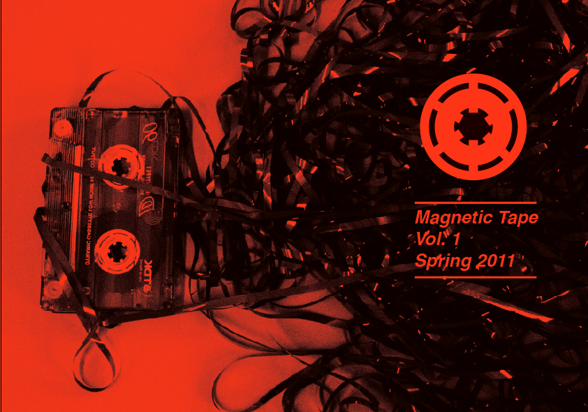
Ok so here are a series of designs I've done both using the photo composition I took initially and a far more basic, build-esque design. I think that the photographic composition suits the style of the music a lot more, and in terms of the typefaces that I've used, helvetica and futura seem to work the most because of their simplicity and immediacy. I tried a few different slab-serif fonts, like onyx, nouvelle vague and p22 Albers, but they're very 'in' in fashion magazines right now, so I'm worried that tonally it's going to come across as more of a fashion magazine if I use one of those fonts, although nouvelle vague is a very attractive font. I think there's a few more things I could try photographically, including using a band photograph, and making type from actual magnetic tape, so I'm going to go back to using my camera and try that.

Too stripped down and emotionless:


Effective:


Too fashion:


Effective:


Using 'multiplied' coloured objects to create illusion of tape, I think this works in an interesting way:


Again, too emotionless:


No comments:
Post a Comment