

I like simple type combined with rich photography that you so often get in fashion design. So whilst we're not directly involved in the photography process, it's important to get something as rich in colour as things like this. If we can afford it I'd love to be able to have a foil block finish. (depending on the size of print run this might not be possible)

Simple, minimal layouts with a lot of white space are also really pleasing to me. The design must seem considered as part of the spac though. With a large amount of white space, the design seems confident, like it can hold it's own and it doesn't need to take up a huge amount of space.

This isn't technically fashion design, but it does drive home how good simple and spacious design can be. The rounded font is interesting too, it might be worth considering something like that for the cover/header type, if it's spacious enough.

'Design Banquet' I chose this example for the print finish and because it uses a slab-serif font, like a lot of fashion magazines these days do. Where there's a huge contrast in weighting across the letterforms.
Another slab serif, and a lovely print finish. Visually, this is the kind of thing I'm drawn to for the fashion book.

The typography and the strong black and white quality is something that I think we should try and apply to the covers at least.
This isn't design for fashion, but a beautifully laid out book all about it. I'm going to try and track this down and borrow it. Hopefully this will give me some further ideas about what is possible in this sector of the culture industry.


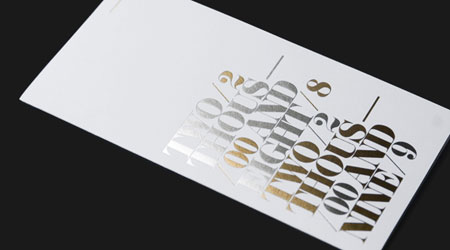
It's an interesting concept here, and the type is well executed, but I can't help but feel that header fonts for fashion need to be a bit more visually engaging. The letter forms need to do something interesting.

again nice slab serif font, combined with black and white photography, it just appears sophisticated and well composed. I want the fashion year book to have a similar level of sophistication.

This isn't a fashion poster, but one for a film. It conforms to some similar conventions to vogue (below) though. I really like the way the typograhy works it's unusual and very elegant, and the colour quality of the photograph is beautiful.

Things I don't like:

I don't like the way this works at all, the type is too bold and clunky, it doesn't suit high fashion at all, which should be elegant. Also it's too busy, there's too many photos and the type is doing too much. It should be stripped right down.

This isn't fashion design at all, but it illustrates a point I want to make. Whilst I think the design of this is very strong, I think we need to be aware as a design team of what the difference between generally good design and appropriate design are. This does not suit a fashion background, it is too dry and without character. It is important that we pick typefaces that illustrate the character of fashion, and we pick them well.
No comments:
Post a Comment